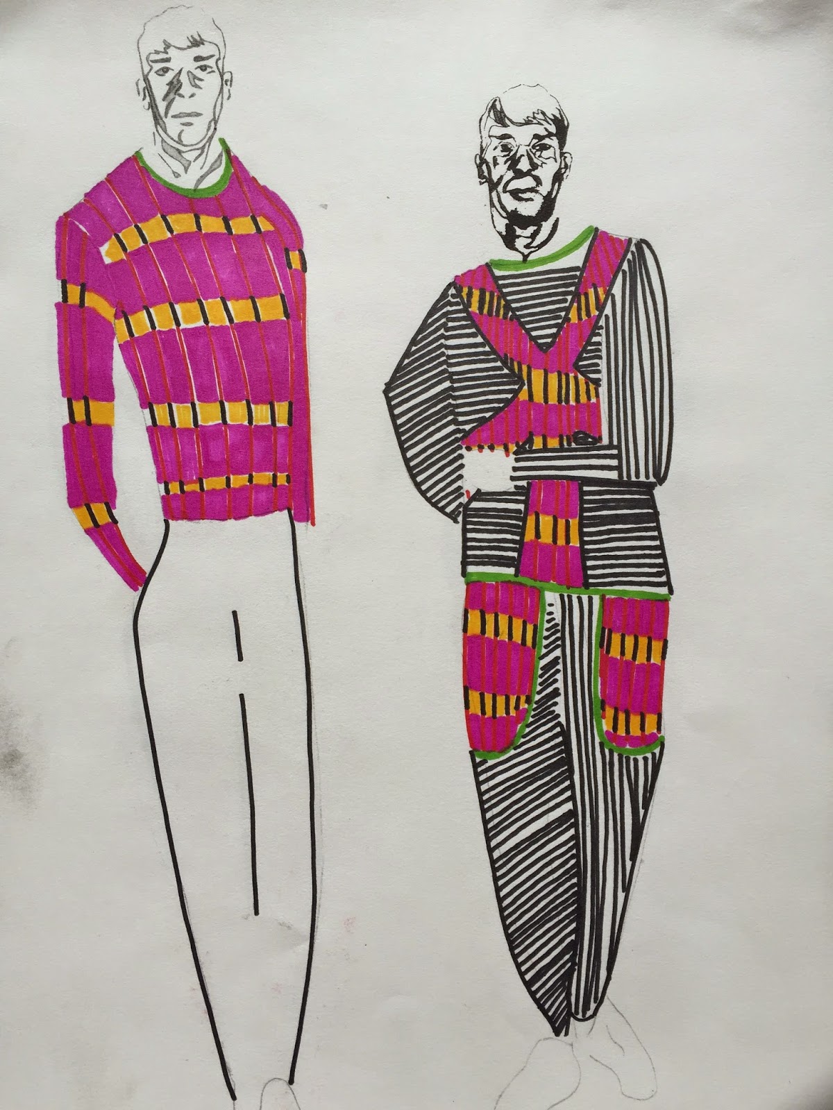
I have chosen five staple items of clothing to base my fashion illustration collection on. I wanted to mix tightly fitted clothing with baggy, bulky items. I aimed to make the collection to look credible as part of the James long brand, so I limited my fabrics down because his existing collections are matching and of a limited palette. I chose the knitted sample that is gridded based on track lengths of The Sex Pistols album 'Never Mind the Bollocks', creating a musical reference in the collection, because the punk movement was heavily expressed through music.I also wanted a reference to the group work in the line up. I have chosen the baseball stitch themed knitwear to be incorporated into the collection because it refers back to the initial research about the Baseball masks that John Cale used to wear. This was done because it was a relation to the punk movement and the controversy that it caused on stage when John Cale wore that mask.I am pleased with the line up as I feel that I have achieved a collection that has incorporated the genre of punk without being to generic. I feel the collection is credible to the James Long brand however I feel that the Collection as a whole is a little more vibrant that they would usually be. The collection embraces the combination of tight silhouettes with looser baggier shapes that I needed in the collection to so that the theme of baseball and stereotypical punk wear was referenced.

Tuesday, 19 May 2015
Final line up


Wednesday, 13 May 2015
James long presentation.

I am pleased with the way that my group and I have presented our work to Tom from James long. The groups samples were placed in album sleeves to divide the work into print, stitch work and knit samples. Tom was pleased with the presentation of the work because it was intriguingly packaged and well organised.

The group work still needs a lot of refining so that it merges together as clear collaborative group work instead of looking like five individual projects. This could be achieved by us manipulating each other's work. I do feel that the way we have worked has given the collection many dimensions and crossed over many creative platforms which is important to the concept of punk because punk is about individuality.
To strengthen my knitwear samples, I need to use more luxurious yarns and build upon the reversible qualities that Tom liked in my knitting patterns.

Bondage
In the fashion drawing work shop it became evident that our group research was fragmented between punk, hip hop and John Kale. This made it difficult to work independently to sketch initial fashion drawings down because our source of visual information was weak. I found that collage isn't an easy way for me to get design ideas down at this stage. To improve that I feel I need to collect images of male poses from advertisements in magazines. I feel that this could help with the Mes en scene of the design collection.
I researched more into the clients style of James Long because the designs have to be credible to his brand. I focused on the knitwear designs and noticed they are fitted tightly to the torso.
 |
| James Long's knitwear |
The patterns usually look patchworked together, which is another feature I would like to incorporate into the designs. I decided to look into the male bondage side of punk that I could pull away shape inspiration and silhouettes that could be relevant to James longs patchwork style without being to crudely obvious to the bondage design.
Fashion Drawing
Today I did my first fashion drawing sessions. I was interested to know the importance of a muse to create the designs. A muse reflects and represents what your collection is about. As a group we are working from imagery of John kale when he was younger. We needed to capture the Raw ruggedness of John Kale's face and neck so that I could reflect a manly edginess connotation to the designs. I found that drawing his mug shot as a group was helpful because our drawing interpretations of his face were contrasting. I felt that we loosened up our drawing style and complimented elements of each interpretation and created more variations based on one another's work.
I would be interested in working together as a group on the design work so that we can use each other's strengths to create more interesting designs. I know that I have a graphic drawing style which I think would work well in combination to Marie's looser more washy drawing style. Because it would add depth and contrast to the designs.


Tuesday, 28 April 2015
Experimenation
The perforated ribbon James Long sample inspired me because because it is an innovated way of creating a fabric surface that looks up market and expensive. I wanted to create a knitted that leather response to that fabric. through experimentation I decided it would be more successful to not occupy each lace hole with leather or ribbon because I didn't want to detract to much from the knitwear's bendable qualities because the fabric would not be wearable if it was to heavy.

I combined the traditional lace hole knitting with leather because punk's would often adapt traditional things in a controversial way. I adapted this knit with leather to introduce a reference to bondage with the neon yellow because the colour battles and rebels against both fabrics in most ways possible.

Stand Work
I started to analyse James longs jumpers to base some of the brands popular jumper silhouettes into the collection of that I was being sensitive to the brand's market. I'm also aware that he collection is for menswear so I want add a modern black base that the knit samples can be embedded into and the yarn qualities can rebel against perforated and scuba fabrics. I collaged my album cover designs over the jumpers. This was a way of experimenting with the placement of where the knitwear will go.

I feel that the knit samples on the stand look dated when they dominate the stand. The colour combinations have a grossness to them that I feel captures the essence of punk, however I feel that the knit would benefit from a black background because it would lift the vibrancy of the colours that was lost because of the combinations of only vivid colours, particularly the pink and green mohair combination.


Monday, 27 April 2015
Sex Pistols tartan
After the tutorial with Elenor we started to throw ideas
around as to how I could create different customised tartans. The idea that
interested me the most seeing as the colour selection is coming from album
cover sources I felt that it would be most appropriate to look at the track
lengths of some of the artists albums. I used ‘Never mind the bollocks’ by the
sex pistols to create a grid by using each minute as a centimetre.


Tartan grid based on the track lengths of 'The Sex Pistols'; 'Never Mind the Bollocks' album.

Yellow stripes in reference to the track lengths.

Colour inspiration for the knitting above. Tartan that I made out of The Clash's album covers.
Tartan
From the
research into the punk movement I have found out that the punks tended to
manipulate traditional British things in a controversial way. The royal Stewart
tartan was a popular tartan that the punks would introduce into the clothing.

In the
history of tartan the ‘Dress Act of 1746’ wanted to ban tartan in Scotland to
prevent warrior clans. When the law was lifted in 1782 tartan was no longer
ordinary highland dress.
The controversy
of the tartan in Scotland could have been the appeal to the punk fashion
movement.
I have
decided to knit some tartan designs in no traditional colours in the design. I
have taken colour inspiration from Jamie Reid’s Sex pistols album cover
designs.


Working
in a team this week has adapted my style as a knitter. This is because I was
keen for my group to help me to select yarns and colours to knit with. This has
challenged my knitting ability because some of the weights of yarns were out of
my comfort zone. I have found this useful because I wouldn’t have pushed myself
without my team’s encouragement. I have also found the feed back from my group
very helpful and inspiring because we negotiated design ideas and improvements
between ourselves.
Tuesday, 17 March 2015
Muse
The Muse we have selected as a group is John Cale, we picked him based on the reading list that was present in James Long's brief. We found that John Cale's band the Velvet underground was an experimental band. He was renowned for controversy and would preform on stage with sports masks over his face. His controversy is what lead my group into pushing the idea of a punk collection that has reference to sports wear due to his masks that he wore.

From researching john Cale I was interested in the links between himself and Andy Warhol. I want the knitwear collection to have links to the pop art culture. I decided to select a vivid colour palette that reflected John Cale's prime time of his career in the 70's.

Monday, 16 March 2015
James Long Presentation by Tom
lecture with Tom
James Longs design process starts conceptually and looks at a broad range of medias for the collections starting point. The 'Devine' collection for A/W 13 was inspired by John Waters films mainly the grungy style of 'Pink Flamingo'. The brand extracted glossy and matt finish fabrics from the concept of gross, grunge style and incorporated them into the collection.

The group Tutorial with Tom was helpful because he helped the group to narrow the starting point of our concept down. We have decided to look at the 1976 Punk movement. Tom wants us to collaborate as a team on the sample to manipulate the fabrics in the experimental way that James Long's team work. He advised that we create a range of moquettes that include leather, faux fur, synthetic hair and burning fabric, foiling at painting the knitting as references to the punk fashion culture. He suggested we looked at the painted leather works Claire Barrow designs to be influenced by the rawness of her work.
Sunday, 22 February 2015
Evaluation
Through
this unit I have had to manage my time carefully so that I could complete both
projects ready for the deadlines. I found it stimulating completing two
projects at the same time because I did contrasting projects, however I found
that the concepts and techniques I used progressed and adapted between the two
briefs. I split my time in a way that I gave priority to my ‘branding’ brief
for initial knitting time and focused on both sketch books through out. I think
that this management worked successfully for me because I like to be devoted to
the sampling as though is a mind map of ideas.


The
branding brief gave me the perimeters of styles to design the samples. I was
very focused on the brand identity and style so my research directly informed
my knitting because I adapted design ideas that the brand had already done but
I was able to adjust the design in my own creative way.
I found
that the time limit on the ‘Branding’ brief made the project fast paced so I
needed to be critically selective over which ideas and visual research I’d
unpick my yarn ideas and knitting compositions from. This was because I wanted
my samples to work well as a collection. I didn’t have a lot of time to make a
collection of development sample. My limited colour palette made me focus on
the knitting skills I used. I found that the charcoal a pen drawing informed
the yarn qualities that I selected, because of this I think there is a clear
correlation between the visual research and the knit samples.


My ‘In the
moment’ brief focused on creating edges and combining different weights of yarn to manipulate the way that the garments hung. The designers research I based my samples on were predominantly not knitwear. I wanted my collection to be a response to the colour and structure trends of garments on the catwalk for Spring 15. I think that my samples have reflected the concept of 'In the moment' by the combinations of techniques used in each sample. I think that all of the samples have an effect of temporariness through the choices of yarns I used.
McQueen suptersitions Yarn Qualities
My colour palette has been limited to monochrome because of my theme of magpies. I wanted to find a colour that could break up the black. I looked at images of magpies wings which I did colour studies from. I decided that a teal would give a small point of interest if it could be placed in the samples discretely in a mohair or chenille because of their feather like features. The chenille has a subtle shine and the mohair yarn could blend with the yarns around it.

Symmetry is a key trait of Alexander McQueen designs. I decided to manipulate my drawings of Photoshop. I repeated and reflected the drawings and used them as silhouettes which helped me to identify the negative space shapes. I created a range of compositions that I later made a punch card from.


This sample is based on the PhotoShop edit of the orginal shape.
Subscribe to:
Posts (Atom)